Modern man in most cases is behind the brand. If the company has declared itself, maintains a reputation and a good image, then customers do not think about the choice, focusing on their favorite company. The logo, in turn, serves as a signal light and causes certain associations. Therefore, the logo plays an important role in the existence of the enterprise, its development and positive perception by people.
What is a logo
The logo is a graphic sign or symbolic emblem that is used by individuals or legal entities to increase public awareness. Each detail of emblems has a special subtext, which affects human perception in different ways.
Interesting! Studies have shown that the more people like the logo, the more they turn to one or another company.
There are several types:
- Text / font. This is the original lettering of the company name through the use of abbreviations, different fonts and letter sizes. Depending on the tools used, within this group, abbreviations, monograms, logo words (differently called trademarks) are distinguished.
- Graphic / iconic. The use of graphic elements (geometric shapes, symbols) as a schematic representation of the activities of the enterprise. For example, a drop of water is associated with soda, air conditioning, and scissors - with an atelier or hairdresser. Here they differ: icons, pictograms, abstract labels, talismans.
- Combined. A combination of 1 and 2 types.
It turns out that a well-made logo increases the efficiency of marketing activities, guarantees the recognition of the company, and distinguishes it from competitors. Thanks to a number of critical functions, the logo becomes an indispensable part of the brand.
How to create a logo
Before creating a "corporate badge", you need to familiarize yourself with the principles of forming the best logos:
- Simplicity. The mark is easier to perceive and faster to remember when the mark is done with a clear message;
- Memorability;
- Durability. You can’t do the logotype on your own, each line should remain relevant and effective even after 50-100 years
Note! The Coca-Cola company logo has not been subject to change since 1885.
- Universality. The emblem must look great, both on business cards and in applications;
- Absolute compliance with the scope and characteristics of the company;
- Uniqueness.
Directly during the "construction" you need to focus on the psychological aspect. For example, regarding fonts:
- Manuscripts are associated with elegance and sophistication, so they are suitable for companies associated with evening dresses, expensive cars, and jewelry.
- A decorative font with curls and an extraordinary presentation makes you want to have fun, play. It should stop manufacturers of toys, amusement parks.
- A serif font is associated with stability and reliability. A good solution for financial institutions, insurance companies.
- Sans-serif fonts are quite simple, so they immediately inspire confidence. A good alternative for trust or consulting firms.
Create Walkthrough
Procedure:
- Make some drafts.
- Draw 5-10 different sketches.
- Select editing tools.
Advice! Experienced designers develop a logo in Adobe Illustrator, Photoshop, Inkscape. Among the free services, Canva is in the top.
- Group all ideas into one element.
- Test logo.
- Check scalability.
- Create multiple formats for different applications.
The best logos of firms and companies
The rating of the best logos in the world includes the development of giant companies and small businesses.
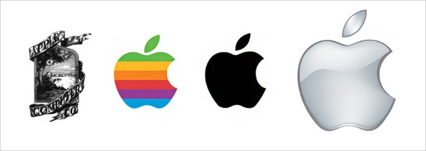
Apple's market leader in electronics has the simplest, most spectacular and memorable character - a bitten apple. Few people knew, however, the first version of the logo was the image of Newton under the apple tree.
Sweets Twix
Initially, the bars were called Raider. However, in the eighties, the British rebranded and defined the new name “Twix” - a combination of the two words “double” and “biscuit”. Such a solution completely conveys to customers the essence of the company.
Coca cola
The only time evolution has returned to its starting point. The managers tried to change the logo, only the changes did not benefit the sales. Why the Cola brand left the original version of the emblem.
Pepsi
The most frequently changed logo in history. The first attempt was completely a failure. The second idea lost its identity due to the great similarity with the previously mentioned company. And only in 1962, Pepsi found expression through:
- lack of a stake prefix in the name;
- choice of three-color gamut (red, blue, white);
- image of a ball.

The colors of the logo are fully used in all products of the company: from bottles to branded accessories
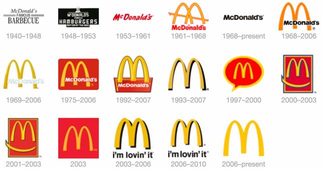
Mcdonald’s
The managers of the corporation went to the well-known letter M for 20 years. Now, if someone sees a similar palette of colors or a letter, the desire immediately comes to eat a delicious burger and drink cola.
Logos are the best in the fashion industry:
- Louis Vuitton;
- Chanel
- Fendi;
- Versace;
- Givenchy.
The top coolest car logos include:
- Jaguar;
- Ferrari
- BMW
- Mercedes
- Audi.
It is worth noting the logo of a sports company. A checkmark in this case does not symbolize some kind of challenge. The creator Carolyn Davidson formed a parallel association with the ancient Greek goddess of victory, Nika. The emblem itself means movement and speed.
The Warner Bros. logo stands out. A bright golden shield in the form of capital letters of the name WB demonstrates the significance of cinema and the brilliance of reality broadcast through screens.
Examples of beautifully designed logos
The following can be attributed to beautiful logos:
- In the City Entertainment is a production studio that creates online content, conducts photo shoots and videos.
- Ryba ve Vode. A Czech online community for mothers with babies that often cannot cope and get tired. Like-minded people communicate at the forum, looking for support and understanding, and therefore feel like "fish in water."
Original! Studio Paws, an Australian small company, has combined bone and barber shop stripes in the logo.
- Families Need Fathers. A social non-profit organization that helps divorced fathers restore and establish contact with children.
Logo design trends 2019-2020
The main trends in the design:
- maximum simplification;
- loss of some fragments (unfinished letters, cut forms);
- just text and nothing more;
- emphasizing the smallest details (for example, through a color unobtrusive transition);
- use of gradients;
- neon - a bright flash in the world of the logo;
- vertical orientation (associated with the increasing transition of all life spheres to the smartphone monitor);
- preservation of all angles and roundness;
- hand-drawn - hand-drawn becomes closer to the heart;
- thin lines.
Like style - a tool for self-expression, and fashion - a small screw in matters of identity. And fashion trends in logo design remain just guidelines, to follow which is the usual choice of developers and customers.

 Top 5 best off-road electric scooters
  TOP-5 electric meat grinder 2020
  12 best electric toothbrushes
  12 best overlocks
  20 best gas hobs

